How to Draw on Watercolor Backgrounds
FreeReverseColoring · Editorial
Quick Answer
Drawing on watercolor backgrounds means using the color as structure rather than fighting against it. The right pens — pigment-based fine-liners, fully waterproof — will not bleed or skip. The right technique means reading the color field for its value edges before you draw a single line, then letting those edges guide your pen rather than imposing an unrelated drawing on top.
Watercolor and ink have been used together for centuries — ink for structure, watercolor for atmosphere. Turner sketched in ink before flooding the page with color. Beatrix Potter drew her outlines first, then filled them with watercolor washes. The combination works because the two media do fundamentally different things: watercolor creates mood, temperature, and light; ink creates form, definition, and hierarchy.
When you reverse that sequence — watercolor first, ink second — the dynamic changes. You are no longer using watercolor to fill in your drawing. You are using your drawing to find what is already in the watercolor. That shift requires a different technique, a different approach to looking at the page, and the right tools.
This article covers all three.
Choosing the Right Pen: What Works and What Does Not
The biggest technical mistake people make when drawing on watercolor is using the wrong pen. On dry watercolor, most pens will work passably, but the differences matter significantly for quality and consistency.
Pigment-based fine-liners are the clear first choice. Staedtler Pigment Liner, Sakura Pigma Micron, Rotring Isograph, and Copic Multiliner SP are all excellent. These pens use waterproof, archival pigment ink that bonds to the paper surface immediately and does not react to the watercolor beneath. The line is consistent, does not skip on textured watercolor paper, and holds its color over time. If there is any residual moisture on the paper, these pens will not bleed.
Nib pens with waterproof India ink (Winsor and Newton, Higgins Black Magic) are the traditional choice for combining ink with watercolor, and they remain excellent for artists comfortable with dip pen technique. The variable line weight possible with a nib — from hairline to broad stroke depending on pressure — is not replicable with fine-liners. The trade-off is that nib pens require more setup, more control, and more tolerance for occasional splatter.
Gel pens work on dry watercolor but tend to sit on top of the paper surface rather than bonding to it. They are prone to smearing, especially on slick or heavily sized papers. On lightly textured papers they can produce a pleasing effect but are not reliable for detailed work.
Ballpoint pens skip on textured watercolor paper and produce an inconsistent line. They work better on smooth paper but are generally not the right tool for this application. Reserve them for loose sketching and gestural work where the texture is acceptable.
Brush pens (Tombow Fudenosuke, Pentel Pocket Brush) offer the variable line weight of a nib pen in a more controlled format. They work well on watercolor if the paper is fully dry and the surface is not too rough. Excellent for calligraphic marks, organic line work, and anything where line quality variation is the point.
The practical guidance: for most people drawing on printed watercolor backgrounds, a set of pigment fine-liners in 0.1mm, 0.3mm, and 0.5mm covers almost every situation. Use the 0.3mm or 0.5mm for primary contours and the 0.1mm for detail and texture work.
Reading the Color Field: How to Find Forms Before You Draw
The most important skill for drawing on watercolor backgrounds is not a drawing skill. It is a looking skill.
A watercolor field is not a flat zone of color. It is a landscape of edges, gradients, value shifts, and temperature changes. Every one of those variations is a potential line. The question is how to see them clearly enough to know which ones to follow.
Squinting is the single most useful technique. Squint at the watercolor until your vision blurs slightly and you can no longer distinguish individual colors. What remains visible are the value relationships — the lights and darks. Where you see a distinct boundary between a light area and a dark area, there is an edge. That edge is where a line belongs. Lines placed at value boundaries will feel integrated with the color beneath them because they are responding to the same visual information.
Identifying the dominant shapes comes next. Before drawing anything, trace the major shapes in the color field with your eye — not small details, but the large masses. Where is the largest light area? Where is the deepest shadow? What is the rough geometric structure of the composition? These large shapes are the armature for your drawing. Get them established first with light, confident marks, then add detail inside them.
Color temperature as edge signal is subtler but powerful. Warm and cool colors in close proximity create a visible boundary even when their values are similar. A warm yellow meeting a cool green-grey creates an edge that the squinting technique might not catch, but your eye resolves as a distinct transition. These temperature edges are excellent candidates for drawn lines — they respond to something real in the watercolor and create a sense of the drawing growing out of the color rather than being imposed on it.
The no-decision rule for beginners: before putting pen to paper, identify three edges you are confident about. Draw only those. Then stop, look again, and identify three more. This prevents the common mistake of starting to draw before you have really looked, which usually results in lines that cut across the color field at arbitrary angles and make the image feel dissonant.
Techniques for Integrating Line Work with Watercolor
Finding the edges is one skill. Marking them well is another. These techniques improve how your drawn lines read against the watercolor beneath.
Vary your line weight to match the value. Edges between very dark and very light areas deserve heavier lines. Edges between similar values — a soft shadow gradually becoming light — deserve lighter, sometimes broken lines. A single uniform line weight applied everywhere makes a drawing feel mechanical. Value-responsive line weight makes it feel observed.
Use broken lines for soft edges. When the watercolor blends gradually from one color to another, a solid unbroken line creates a hard boundary that contradicts what the paint is doing. Instead, use a series of short marks — suggest the edge rather than stating it. This is particularly useful for botanical subjects, clouds, fabric, and any organic form where edges are naturally soft.
Add texture within forms, not just at outlines. Outlines define shape; texture defines surface. Once the main contours are placed, crosshatching, stippling, or parallel hatching inside forms adds the sense of material — bark, petal, water, stone — that makes a drawing feel inhabited. The watercolor provides the color and light; the texture marks provide the sense of what the thing is made of.
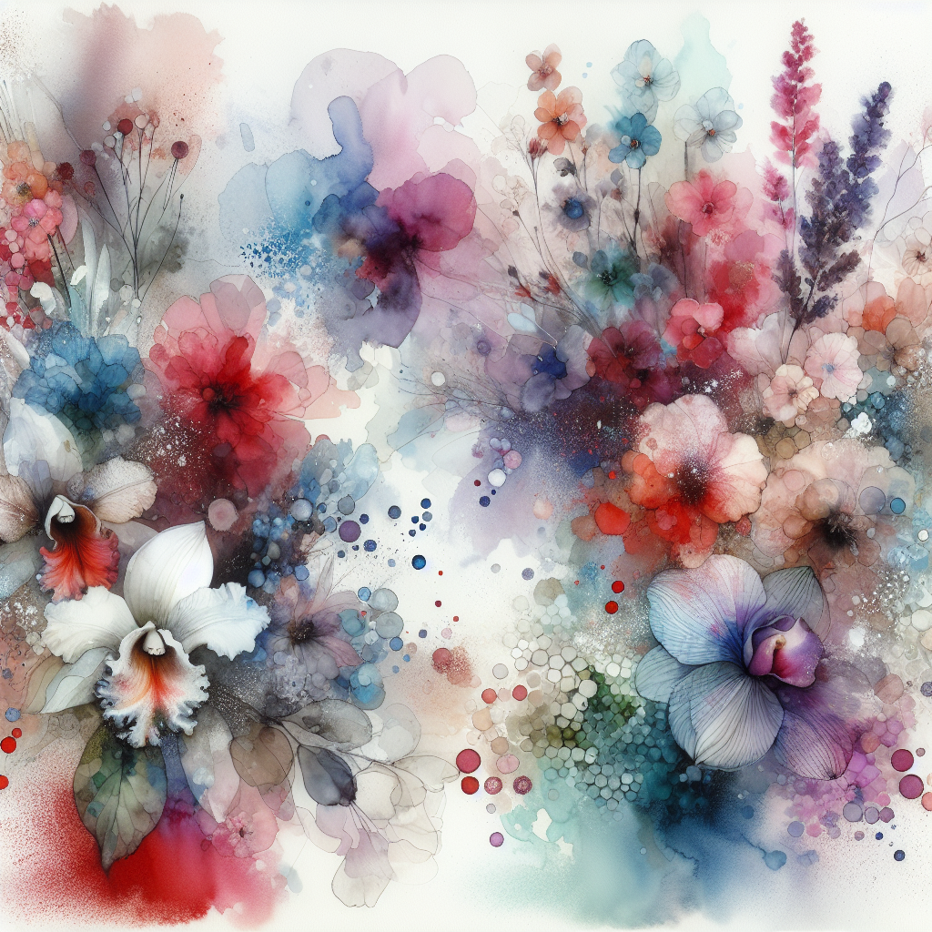
Whispers of Bloom
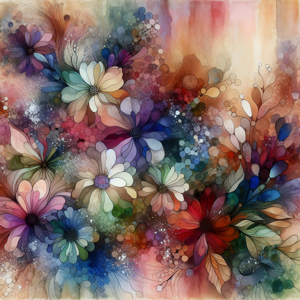
Whispering Petals
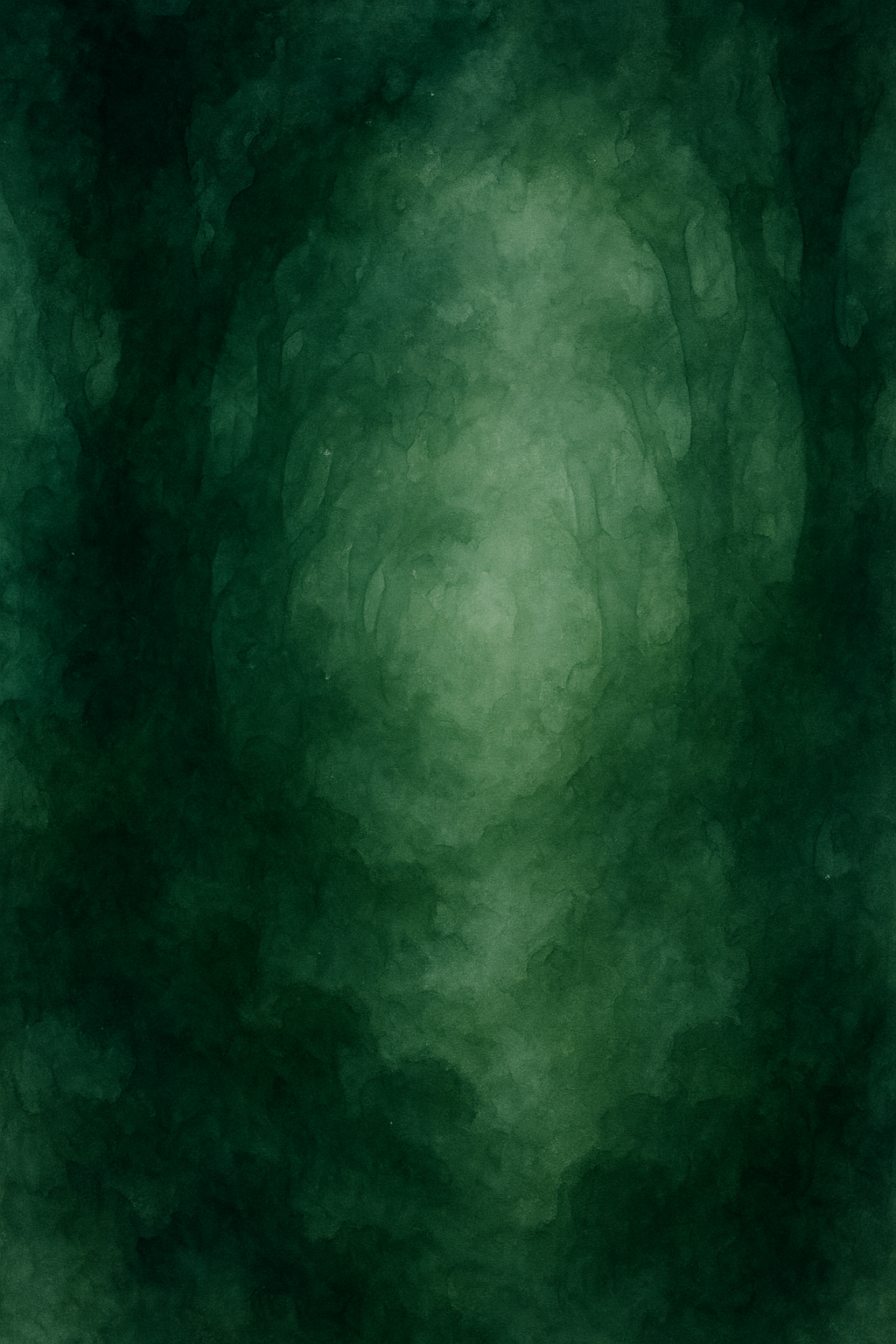
Veiled Verdure
Draw the background last, if at all. The most common compositional mistake when drawing on watercolor is treating the entire image as needing equal amounts of line work. It does not. The focal area of the image — where you want the eye to land — should have the most defined line work. The background and peripheral areas should have less, or none. Letting the watercolor carry those areas without line support makes the focal area more prominent by contrast.
Lean into the color, not against it. If a watercolor background has a strong warm, golden tonality, a sepia or warm brown pen will feel more natural than black. If the background is cool and blue-green, a dark navy or warm grey pen maintains harmony. Black works on almost any background but reads as the most neutral and graphic choice. When you want the drawing to feel like it grew out of the watercolor rather than being layered over it, matching ink temperature to color temperature is one of the most effective techniques available.
Composition: What to Emphasize and What to Leave Alone
Drawing on watercolor is a compositional act, not just a technical one. Where you place lines, what forms you define, and what you leave as pure color field all determine how the finished piece reads.
"The watercolor already has a composition. Your job is to clarify it, not compete with it."
The color field in a watercolor background usually has an implicit focal point — the area of highest contrast, most intense color, or most complex variation. Find that area and let it guide where you put your most detailed line work. If the most visually active part of the watercolor is in the upper left, draw most of your lines there. Let the rest of the background breathe.
Resist the urge to draw everything. Blank areas of color are not problems to be solved with line work. They are resting places for the eye, areas of visual quiet that make the drawn sections more impactful. Some of the most effective mixed-media work combines dense, confident line work in one area with completely untouched color field everywhere else.
Consider the implied narrative. Watercolor backgrounds often suggest environments — a forest canopy, a garden in bloom, water in motion, open sky. What kind of subject makes sense in that environment? A detailed botanical drawing on a dense green background reads as naturalist illustration. An architectural fragment in a misty, atmospheric background reads as memory or place. The color is already telling a story; the lines you add can either confirm that story or deliberately subvert it for interesting effect.
Scale matters. The size of the marks you make relative to the scale of the background shapes determines whether the drawing feels integrated or superimposed. If the watercolor has large, sweeping washes and you draw very small, tight details everywhere, the two scales fight each other. Match the scale of your line work to the scale of the color shapes beneath it.
Using Reverse Coloring Backgrounds as Practice
The technique of drawing on watercolor is directly exercised every time you work with a reverse coloring background. The core task — reading a color field for its edges, deciding which lines to place, and integrating line work with an existing color composition — is exactly what these backgrounds are designed for.
The advantage of working with purpose-made backgrounds is that they are compositionally considered. A reverse coloring design from FreeReverseColoring.com is generated with visual balance in mind: there are areas of complexity and areas of simplicity, value contrast that creates a focal point, color relationships that create harmony across the image. You are not working against an arbitrary color field — you are working with one that has already been organized to reward careful looking.
This makes these backgrounds particularly useful for practicing the compositional principles above. Because the background is already well-composed, your job is primarily to read and respond rather than to impose. That is a lower-stakes and more productive learning environment than starting from scratch with your own watercolor wash, which introduces compositional decision-making before you have practiced the line-work response.
If you are using reverse coloring as a stress-relief or mindfulness practice, the techniques here will make your sessions more satisfying — the line work will feel more purposeful and the finished piece more coherent. If you are using it as drawing practice, they will give you a framework for making the looking as intentional as the drawing.
Top tip
Before you draw a single line on a watercolor background, spend 60 seconds just looking. Identify three large shapes, the highest-contrast area, and one edge you feel confident about. Starting from that point of understanding produces far more integrated results than starting immediately.
A Note on Paper and Printing
If you are printing watercolor backgrounds from a digital source, paper choice affects the quality of the pen work significantly.
Printing on standard copy paper gives you a flat surface that accepts pen well, but the image will lack the texture and depth of genuine watercolor paper. It is a perfectly workable option for practice and casual use.
For more considered work, printing on heavyweight matte inkjet paper (90-120gsm) provides better color depth and a surface that accepts fine-liner pens more sympathetically than copy paper. Some inkjet papers have a slight tooth that mimics the texture of hot-press watercolor paper, which is the ideal surface for detailed pen work.
Genuine watercolor paper run through an inkjet printer is possible but requires specific paper types designed for inkjet use (Hahnemuhle Photorag, Canson Baryta) and a printer capable of handling the weight. For most people, heavyweight matte paper is the practical optimum.
How to Draw on Watercolor Backgrounds
The right pens, techniques for finding form in color, and composition tips for adding ink to any watercolor background. Free designs at FreeReverseColoring.com
Get a new watercolor background every week
Subscribe free and receive a new AI-generated watercolor design in your inbox every week — ready to print and draw on.
Free forever. No spam. Unsubscribe anytime.
Frequently Asked Questions
What kind of pen works best on watercolor paper?
Pigment-based fine-liner pens are the most reliable: Staedtler Pigment Liner, Sakura Pigma Micron, or Rotring Isograph. These are waterproof, do not bleed on damp paper, and hold a consistent line. Avoid water-soluble or gel pens, which smear on watercolor surfaces.
Can I use a regular ballpoint pen on watercolor?
You can, but with limitations. Ballpoint ink is oil-based and will not bleed, but it skips on textured watercolor paper and produces a scratchy, inconsistent line. For light-colored backgrounds or when a sketchy quality is intentional, it works. For confident outlines, a pigment fine-liner is better.
Should I draw on the watercolor before or after it dries?
Always wait until the watercolor is completely dry. Drawing on wet or damp watercolor causes the pen tip to snag on the paper surface, pushes pigment around, and allows ink to bleed into the wet areas. If you are printing backgrounds on a home printer, the surface is already dry.
What line weight should I use for watercolor backgrounds?
Start with a 0.3mm or 0.5mm fine-liner for main contours and a 0.1mm for detail work. Avoid lines heavier than 0.8mm unless you are working on a large format or want a bold graphic look. The watercolor provides the visual weight; the line only needs to define form.
How do I know where to draw lines in a color field with no obvious edges?
Look for value shifts rather than color changes. Squint at the background until the colors lose their identities and you can only see lights and darks. Where a light area meets a dark area, that is an edge. Draw the line at that boundary. This works even in very soft, blended backgrounds.
Is it okay to use multiple pen colors when drawing on watercolor?
Yes. Dark brown or sepia pens work well on warm-toned watercolor backgrounds and feel more organic than black. On cool or desaturated backgrounds, a dark blue or warm grey pen can be more sympathetic than black. Black works on almost any background but can read as harsh on very soft, pale watercolors.